The Verdict: If your bot still relies on “Reactions” for user interaction, you are living in the past. Buttons are not just an aesthetic upgrade; they are the standard for friction-less user experience. They eliminate rate-limit bottlenecks, reduce user error, and transform clunky text commands into a sleek, app-like interface.
It has been years since Discord introduced the Message Component architecture, yet many developers still sleep on its potential. Buttons are the bridge between a “Chat Bot” and a “Micro-App.” This guide covers why you need them, how to style them, and the tactical use cases that drive engagement.
The Death of “Reactions”
Before Buttons, we forced users to click tiny emoji reactions to navigate menus. It was slow, prone to API rate limits, and looked messy. Buttons solved this.
Why the Shift Matters:
- Zero Friction: One click triggers an immediate interaction. No “waiting for the reaction to register.”
- Space Economy: You can stack multiple buttons in a single row, keeping chat clean.
- Visual Hierarchy: Use colors to guide the user’s eye (e.g., Green for “Accept,” Red for “Decline”).
The Elite Arsenal: Use Cases
Don’t just add buttons for the sake of it. Use them to solve specific behavioral problems.
1. The “Pagination” Infinite Scroll
- Context: Displaying leaderboards or inventory lists.
- The Button Fix:
[Back][Next]buttons allow users to flip through pages of data without spamming the chat with new messages.
2. The “Gatekeeper” (Approval Flows)
- Context: Application systems or moderation tickets.
- The Button Fix: Admins see a ticket with
[Approve](Green) and[Deny](Red). One click executes the logic and logs the result.
3. The “Quick-Fire” Poll
- Context: Community feedback.
- The Button Fix: Instead of typing commands, users vote on options
[A][B][C]. It’s instant and mobile-friendly.
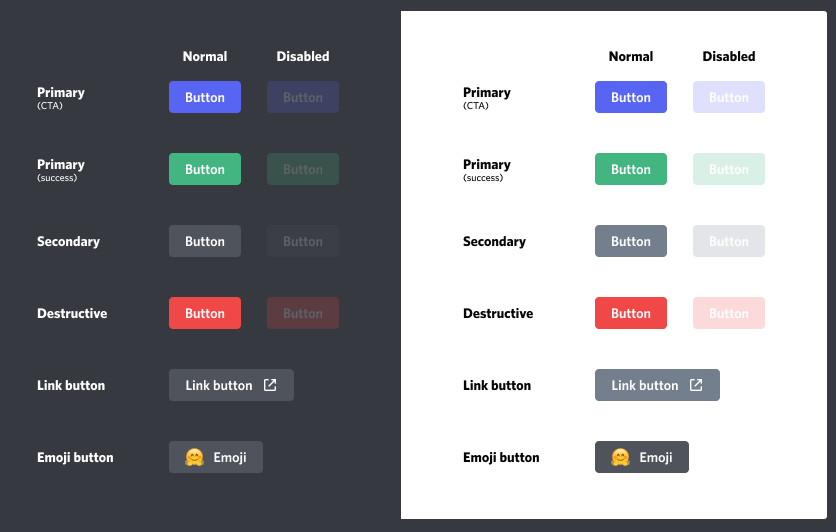
Visual Identity: The Style Matrix
Discord limits you to specific styles, but using them correctly is an art form.
| API Style | Color | Best Use Case |
| Primary | Blurple | Main Call-to-Action (e.g., “Page 2”, “Confirm”) |
| Success | Green | Positive actions (e.g., “Accept”, “Start Game”) |
| Danger | Red | Destructive actions (e.g., “Delete”, “Ban”, “Cancel”) |
| Secondary | Grey | Neutral/Optional actions (e.g., “Settings”, “Back”) |
| Link | Grey (External) | Navigates out of Discord (e.g., “Visit Dashboard”) |
Pro Tip: You can attach Emojis to buttons to increase click-through rates. A
[🗑️ Delete]button is processed faster by the human brain than text alone.
Implementation Protocol
To deploy buttons, you need to utilize the Message Component endpoints in the Discord API.
- Define the Action: What happens when clicked? (e.g., emit an interaction event).
- Assign the ID: Every button (except Links) needs a
custom_id. This is how your code knows which button was pressed. - Handle the Event: Listen for
interactionCreatein your code to execute the logic.
Refer to the official Developer Portal documentation or the Interactions channel in the Discord Developers server for syntax specifics.
FAQ Vortex
Q: Can any bot use Buttons?
A: Yes. Buttons are a universal feature available to all bot applications, regardless of verification status.
Q: Can I customize the colors beyond the four presets?
A: No. You are locked to Blurple, Green, Red, and Grey. This ensures UI consistency across the platform.
Q: What is the main advantage over Reactions?
A: Speed and Reliability. Reactions often hit rate limits (processing delays) when many users click at once. Buttons handle concurrent interactions significantly better.
Q: Can I put an emoji inside a button?
A: Yes. You can combine text and emojis, or use emojis as standalone buttons for a minimalist look.
Zenith CTA
Your users demand modern interfaces. Stop forcing them to type commands or hunt for reaction emojis. Refactor your menus today and upgrade to the Button standard.